Advertisement Examples
Health and fitness advertising can be tough. However, knowing a few key best practices and getting inspired by advertisement examples can help make the process easier. Let’s break down a few tips for writing the best possible health and fitness ads, and look into some top-notch examples for banner advertising.
Writing the Best Possible Advertisements
When it comes to the health and fitness industry, it’s vital to use emotional connections to create interest in the advertisement. When it comes to static banner ads that are simply images and text, this can be difficult. We recommend using imagery and copy that is relatable and non-intimidating to really make your audience comfortable with the ad.
Just as well, your call to action is key, especially for small ads that can’t fit a lot of copy. A clear, visible button in the foreground with words like “save now” or “shop now” works well, but only if the imagery and other copy in the ad can tell a story. Context clues are key, so don’t be too conceptual with your ads. Your viewer should know exactly what you’re selling and what you want them to do with minimal ad space.
Just as well, you should keep your ads simple in the health and fitness niche. Busy ads with a ton of imagery and text can be overwhelming for viewers. Display the product or use case of the service as clear and plainly as possible. Your viewers should know exactly what you’re trying to show them and what type of call to action you want them to follow. HD images are key here.
Advertisement Examples
There are a lot of excellent advertisements out there that are effective in the health and fitness niche. Here are 3 ads we like.

Adidas
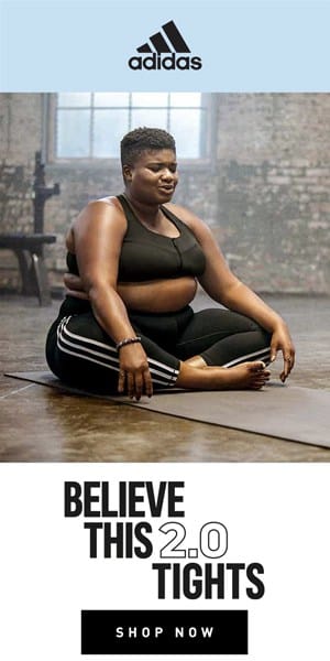
Viewers tend to be attracted to health and fitness ads that are relatable and feature a person in some capacity, not just an article of clothing or pair of shoes. This Adidas ad is a great example of promoting a product with a relatable image– in this case, it is a person breathing out while doing yoga, wearing the product.

Spanx
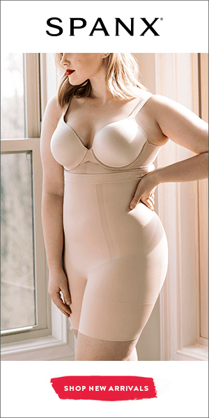
This ad is the perfect example of simplicity at work. This banner ad shows the product as it is meant to function. It forms to fit the model wearing it and is aesthetically pleasing. The moody lighting and neutral colors aren’t intimidating and make the viewer feel comfortable with the product.
Target

Target
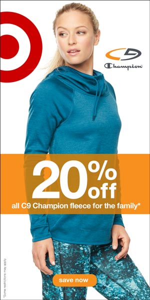
When it comes to ads that span multiple retailers, this example works beautifully. There is no excessive copy here. Rather, the Target and Champion logos sit in the background, the model is in the middle ground displaying the product, and the value statement (20% off) is in the foreground.


